Arthur Erickson Place
Part of a team that rebranded a historic Vancouver office building and built the digital marketing strategy to lease it.
Deliverables:
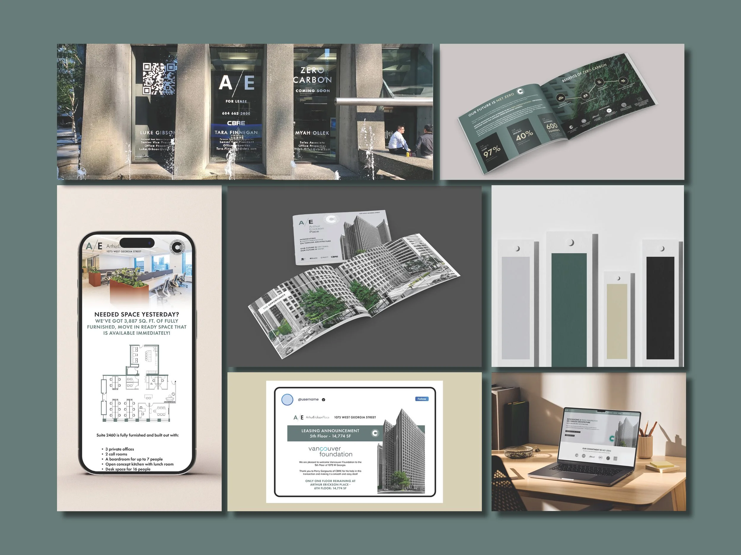
Brand refresh, digital strategy, website, email campaigns, social media, brochure
Year:
2024 – Present
Client:
Kingsett Capital
Role:
Digital Marketing Coordinator / Graphic Designer
Agency:
CBRE
The Challenge
Arthur Erickson Place is a Vancouver office building named after and designed by one of Canada's most celebrated architects. But it was aging, and vacancy was a problem.
The client needed a rebrand and a marketing strategy to attract tenants, at a time when remote work was pulling people away from offices entirely. The pitch had to answer a tough question: why would someone choose to lease space in an older building in this market?
The Approach
Positioning — old meets new:
The building had something most competitors didn't: real history and a famous name. But history alone doesn't lease offices. We paired the architectural legacy with a forward-looking story: a zero-carbon initiative, modernized amenities, and Ready Set Go suites, fully furnished spaces tenants could move into immediately. Mixing heritage with sustainability gave us a compelling narrative that felt unique in the market.
Brand direction:
The visual identity reflected that duality. Grey and black rooted the brand in the building's history. Green and gold pushed it forward, representing the zero-carbon commitment and the refreshed spaces.
Audience:
We targeted businesses looking to move into office space quickly, leading with the Ready Set Go suites as the entry point. The sustainability story and building prestige closed the deal for tenants who cared about where they work, not just how much it costs.
That's the kind of marketing I believe in. Not manufactured campaigns dressed up as community involvement. Real initiatives that happen to also be great marketing.
The Execution
Brand & Identity:
Built around the architect's name and legacy. The brochure balanced green imagery representing the zero-carbon initiative with the building's history and character. The history is what made it unique, so we never buried it.
Website:
Mirrored the brochure's structure. Building certifications and the net-zero commitment were featured immediately to establish credibility before anything else.
Email:
Led with the Ready Set Go suites, but we also promoted leasing success stories, which consistently outperformed other content. In a declining market, showing that other tenants were signing built confidence. We also invested time in building clean, credible email lists rather than blasting to volume.
CLICK TO EXPAND
Social:
Echoed the email strategy across platforms. Consistent messaging, same content pillars, adapted for the channel.
The Outcome
Global Finalist — CBRE Marketing & Design Award, competing against 100+ offices worldwide
61.6% average email open rate vs. 19–22% industry average
24 units leased across the campaign period
Won the next project — Client skipped the usual rebid process and retained our team directly
Reflection
This project taught me how powerful a clear story is in marketing. The building had history that most competitors couldn't match. We didn't ignore the challenges, we reframed them. Old became heritage. Aging became sustainability. And a clear narrative turned a tough lease into a compelling opportunity.